Project Overview
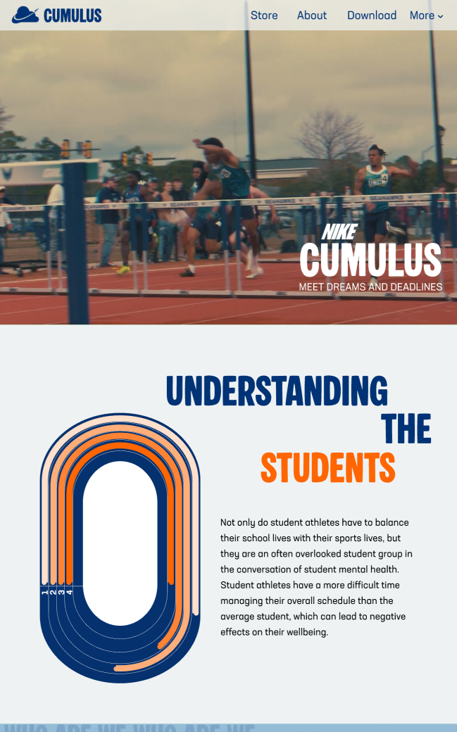
Nike Cumulus is a Nike sub-brand concept designed to support student athletes by addressing the challenge of balancing academics, athletics, and mental health.

Research Insight
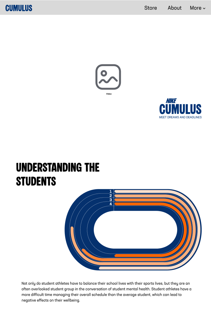
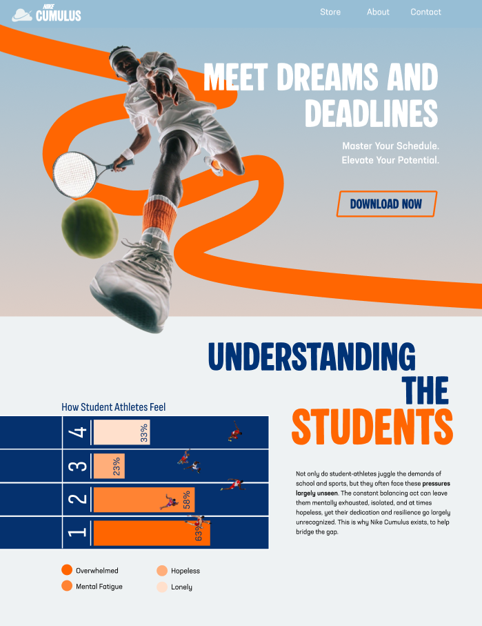
Research showed that student athletes often feel overlooked in mental health conversations and struggle with time management, scheduling conflicts, and pressure from coaches, professors, and performance expectations

Interview Insight
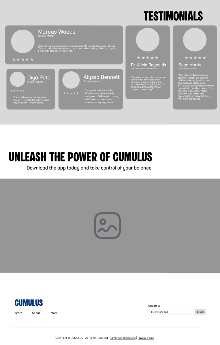
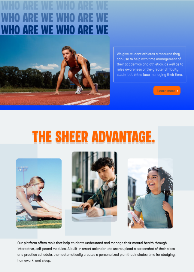
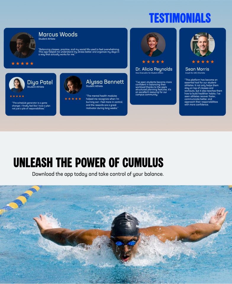
Audience interviews revealed strong enthusiasm around tools that could help manage schedules and reduce stress, while competitor analysis showed that existing platforms typically focus on either performance management or mental health, but rarely both. These insights highlighted the need for a unified platform that supports student athletes’ wellbeing while helping them stay organized and perform at their best.
OUR Unique Value
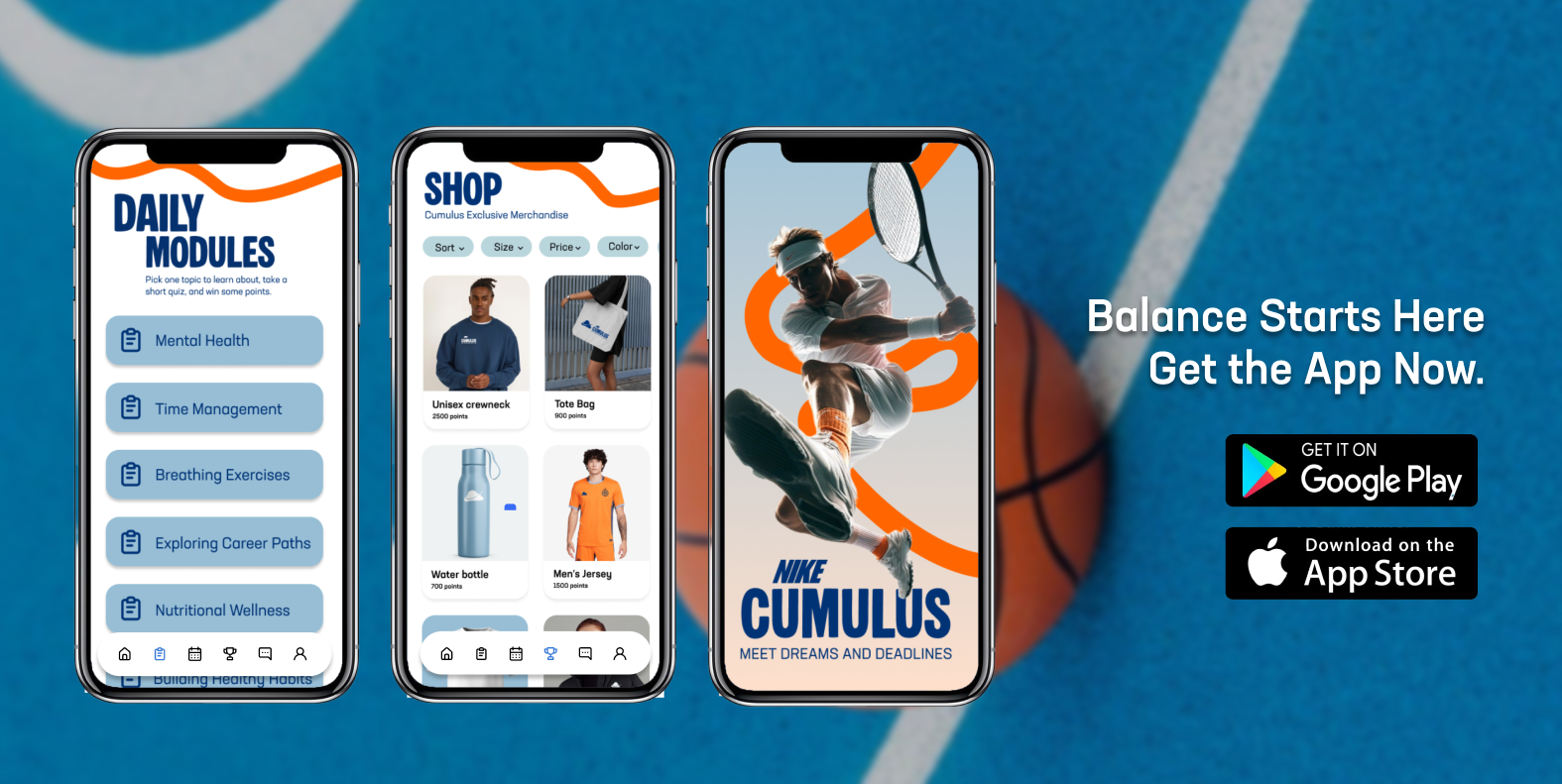
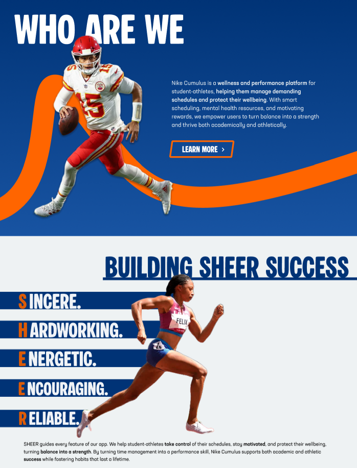
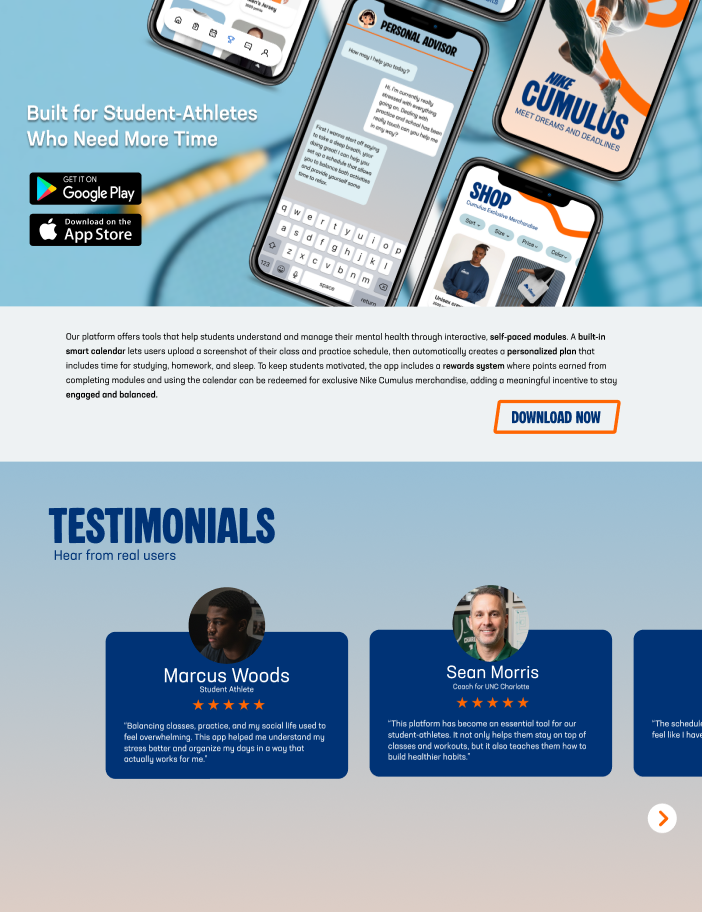
Nike Cumulus solves this problem through a mobile app that combines mental health education, AI-assisted scheduling, and performance support in one platform. The app includes self-paced mental health modules, a smart calendar that generates schedules from uploaded practice and class timetables, and a rewards system that encourages engagement through redeemable Nike merchandise.
Visual Identity and Design Development
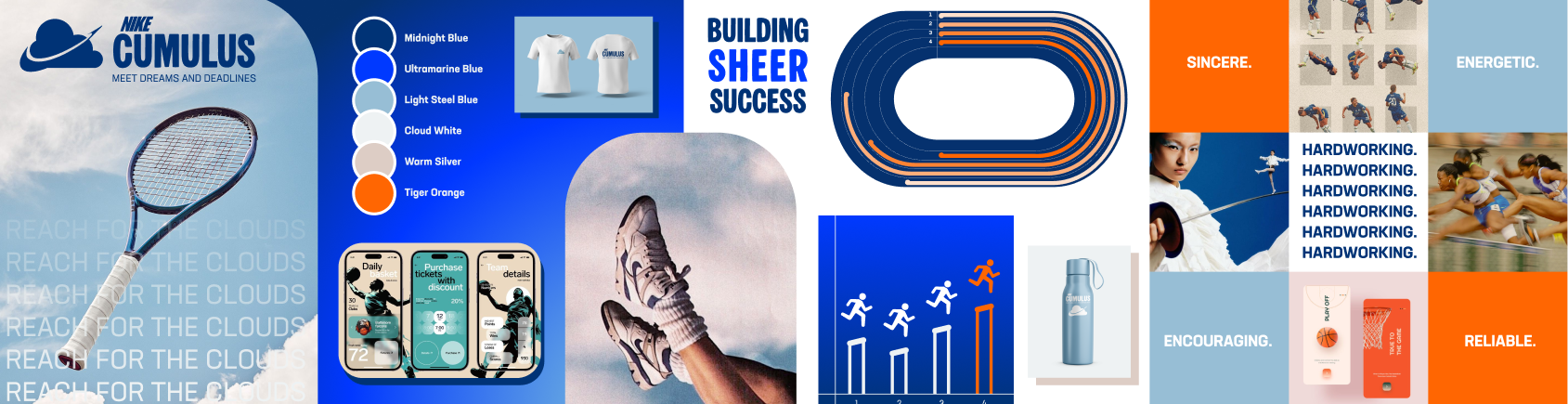
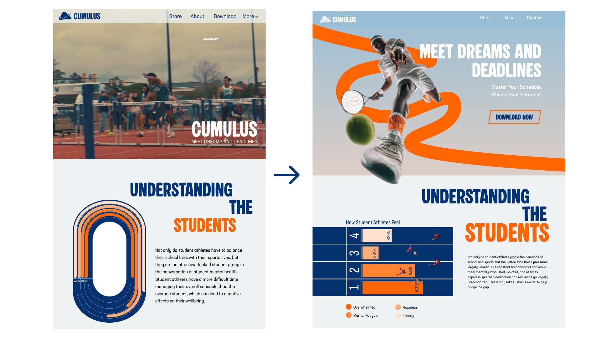
The design process included style scape development, high-fidelity prototyping, and A/B testing to improve readability, visual clarity, and user flow, leading to a refined interface with dynamic athlete imagery and a cohesive high-energy visual identity.
Styleguide
Wireframe
High Fidelity 1
A/B Testing
Final High Fidelity
Final Experience and Prototypes
The final outcome is a user-centered digital experience that promotes wellbeing, improves time management, and demonstrates strong UX research, branding, and iterative design skills.