Brand Overview
Kanvus is a company that sells K-pop lightstick blind boxes that customers can customize by painting, giving them a fun, creative, and highly personal experience. The “K” in Kanvus represents K-pop, while the “U” symbolizes the fans themselves, showcasing that K-pop fandom is built by “us.” The brand primarily targets young teens, especially female K-pop fans, who enjoy collectible merchandise and hands-on customization. Kanvus aims to blend creativity with fandom culture, turning each lightstick into a unique expression of identity and artistry.
Project Details
For this project, I was responsible for developing the brand identity, designing the tuck boxes, and creating the product display case.
Brand Identity
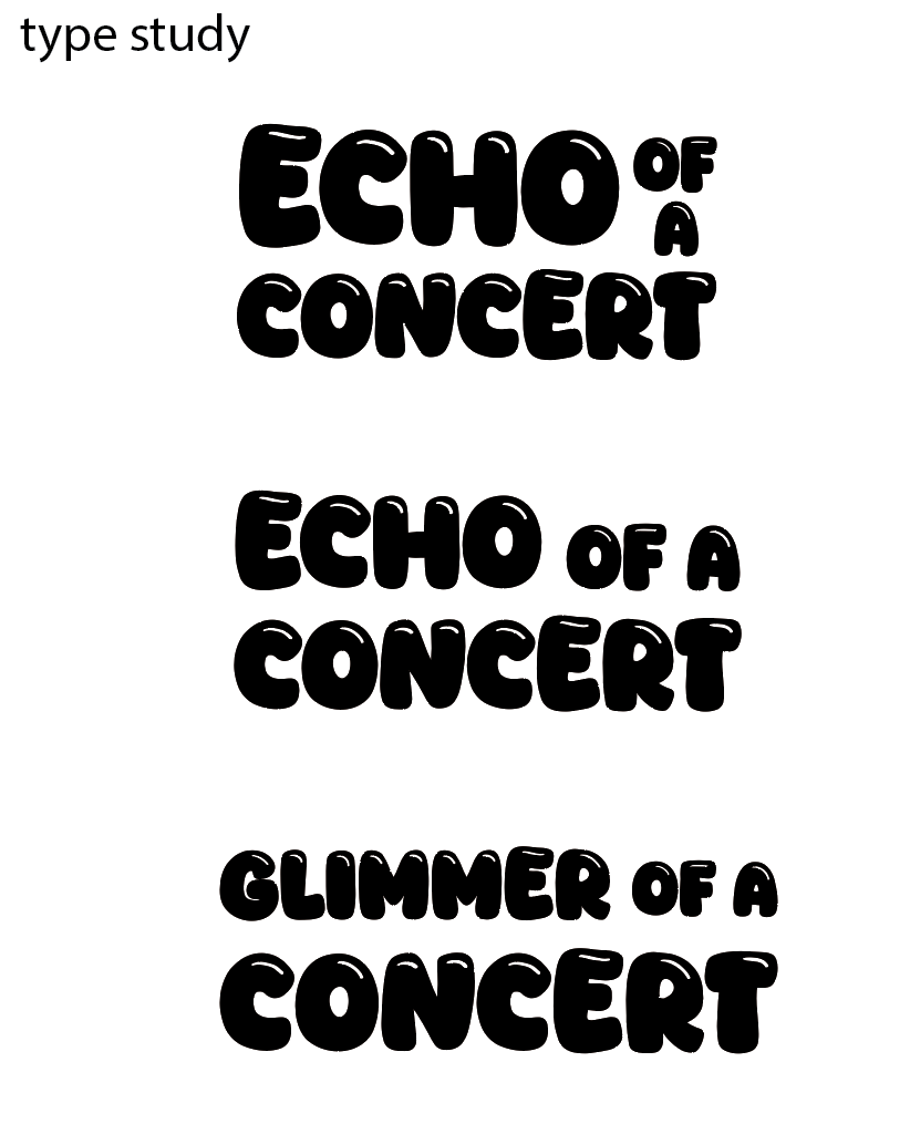
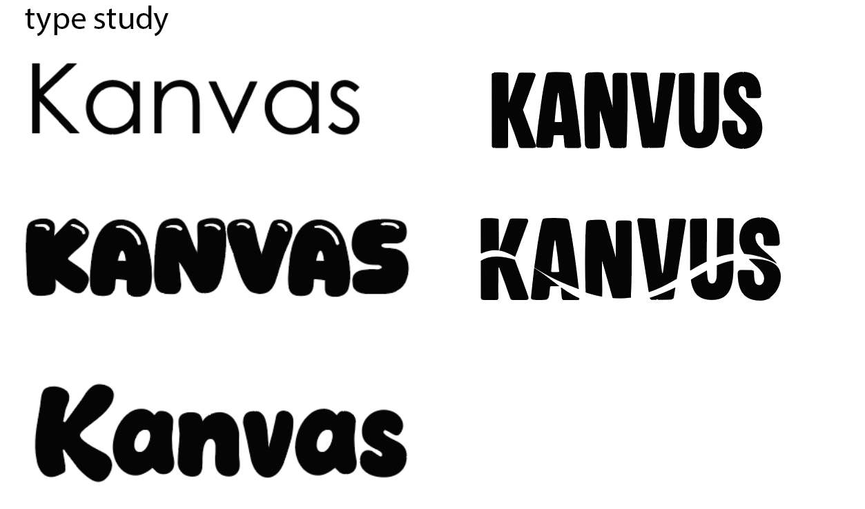
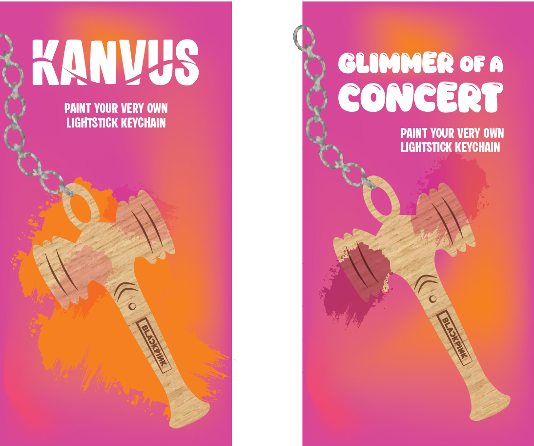
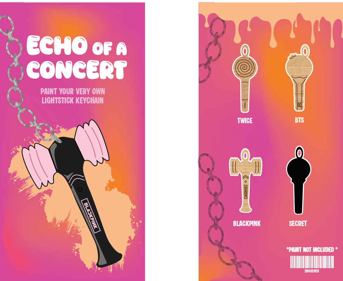
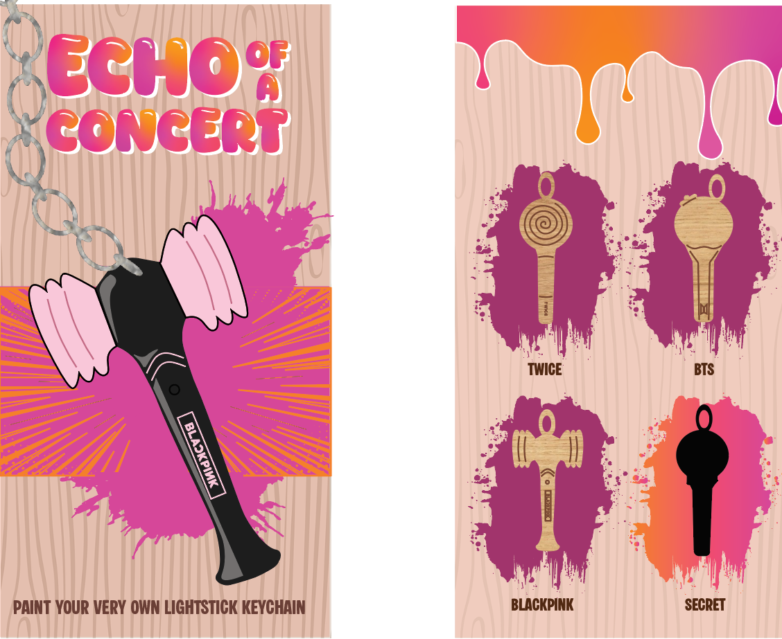
Originally, the brand was named Echo of a Concert and Glimmer of a Concert, but these names didn’t fully capture the playful, artistic, and K-pop-inspired spirit I wanted to convey. The final name, Kanvus, combines “K” for K-pop and “U” to highlight the fans themselves, reflecting the interactive and creative nature of the brand. Kanvus embodies a colorful, fun, and playful personality, offering fans a hands-on experience that lets them personalize their lightsticks while celebrating the energy and artistry of K-pop culture.
Logo Type Studies
Developing Product Designs
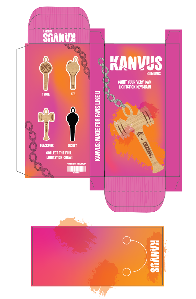
Here, I experimented with the composition, color, and texture of the tuck box, designing it to fit the dimensions of the keychains.
User Feedback
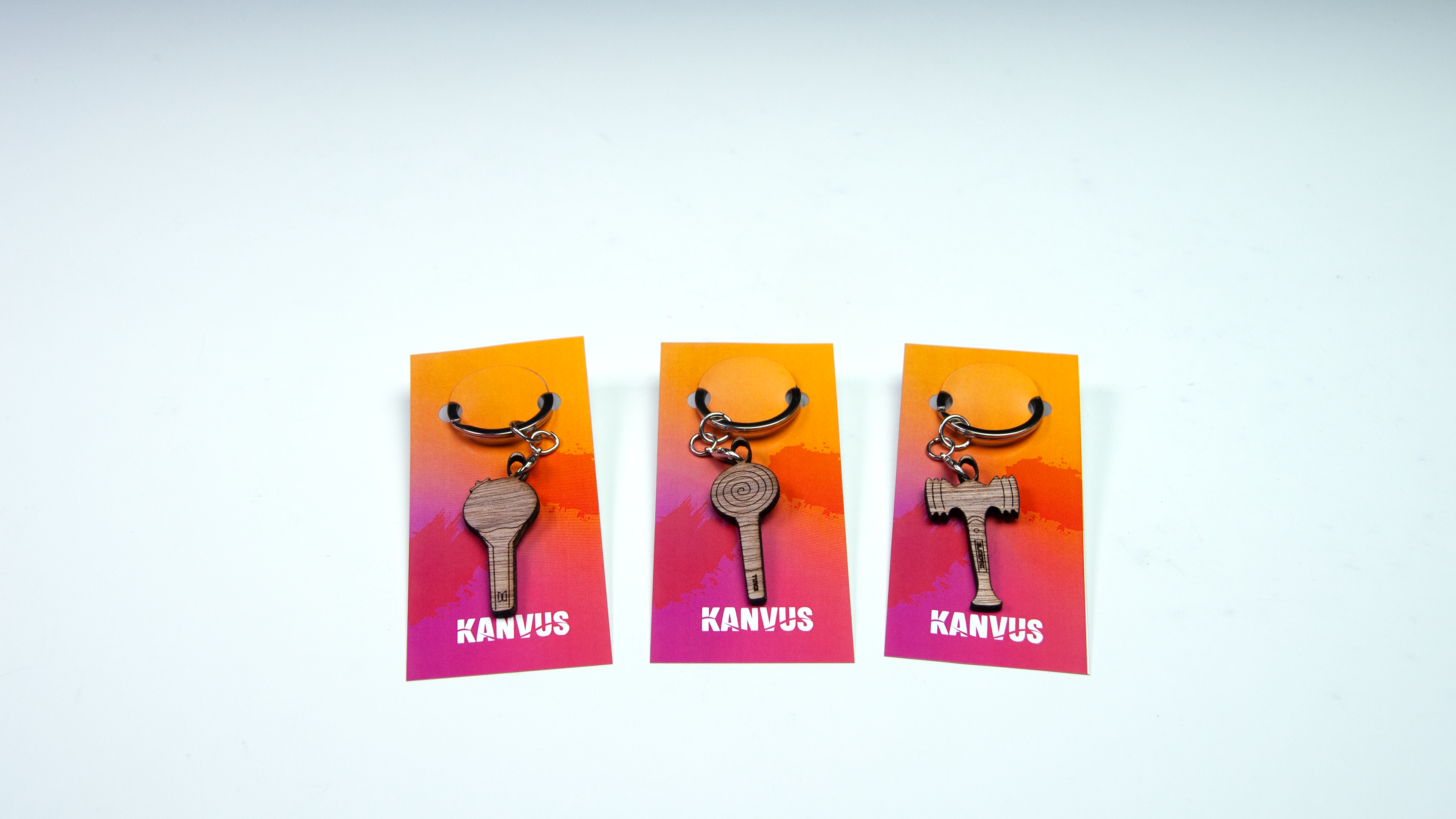
Peers noted that displaying the wooden keychain was essential, as it clearly communicates the product to potential customers. They also highlighted that the pink and orange color scheme aligned well with the brand, reinforcing its playful concept. However, feedback indicated that the paint drips on the back resembled slime, so I was advised to explore alternative ways to incorporate the painted effect.
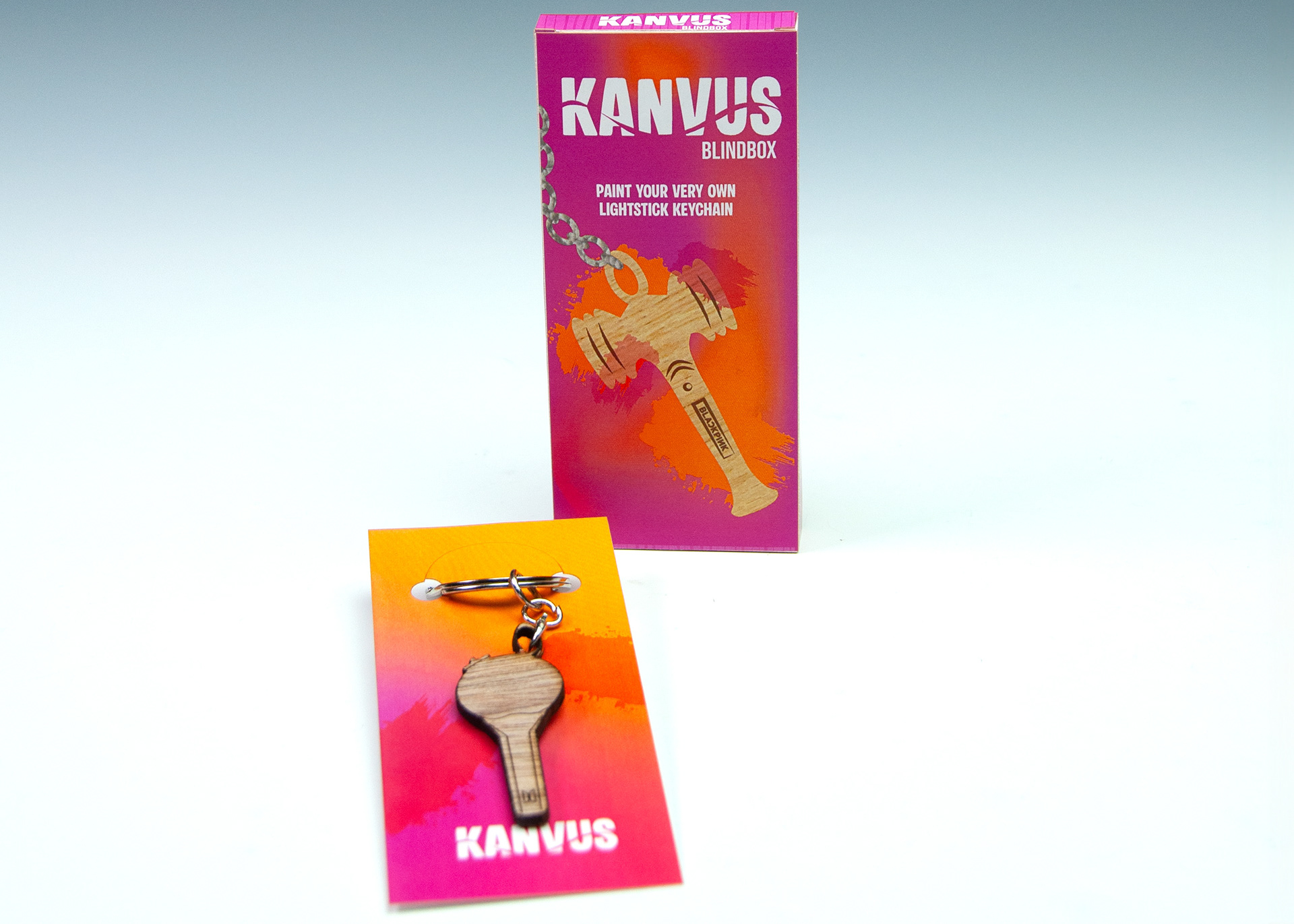
Final Tuck Box
Based on user feedback, I retained the pink and orange color scheme and incorporated the chain details throughout the back and sides of the packaging. On the card holding the keychain, I used a similar gradient and added paint swatches to align with the brand’s playful aesthetic. Finally, I applied the design to the tuck box template, preparing it for printing and laser cutting.
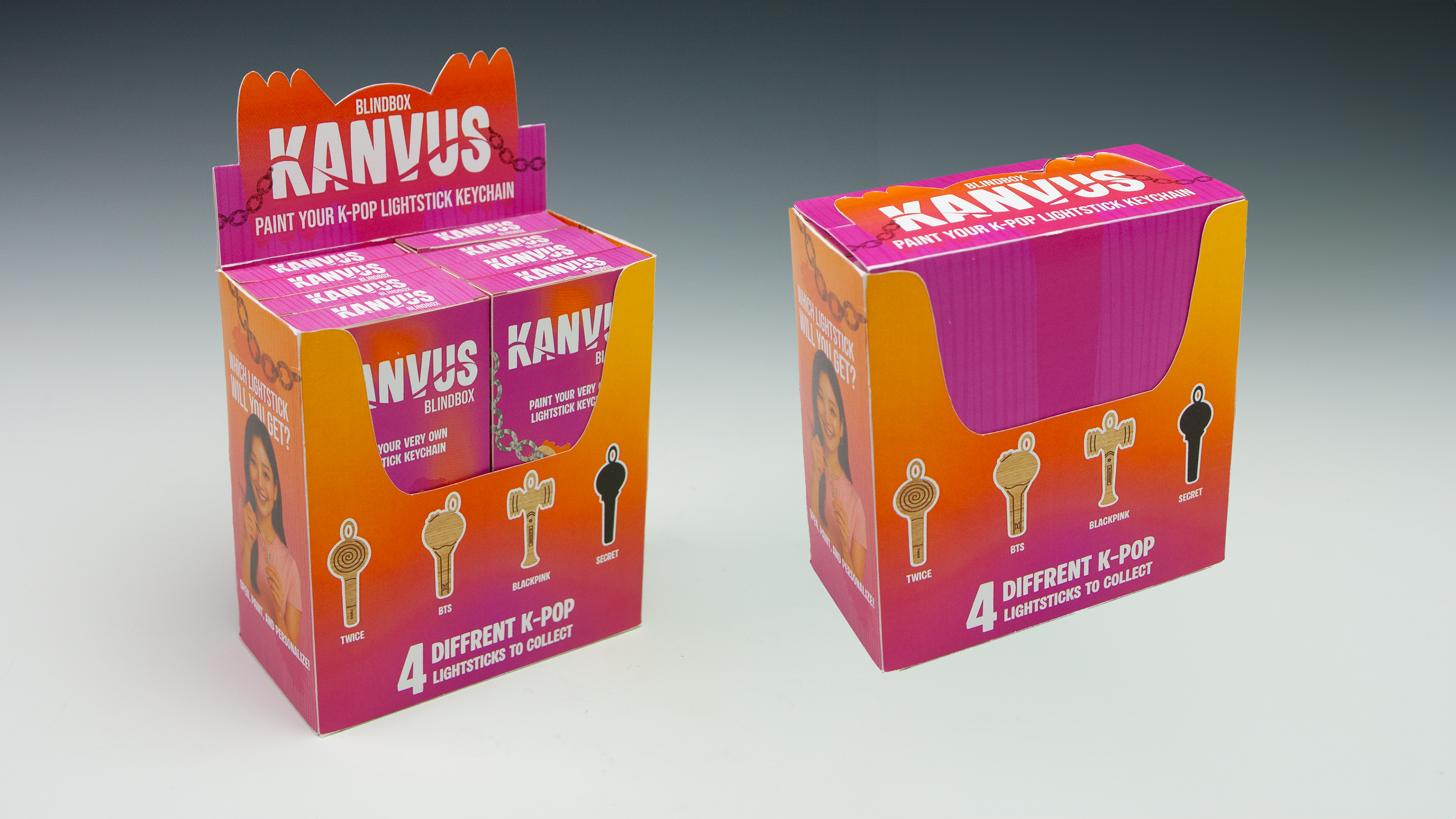
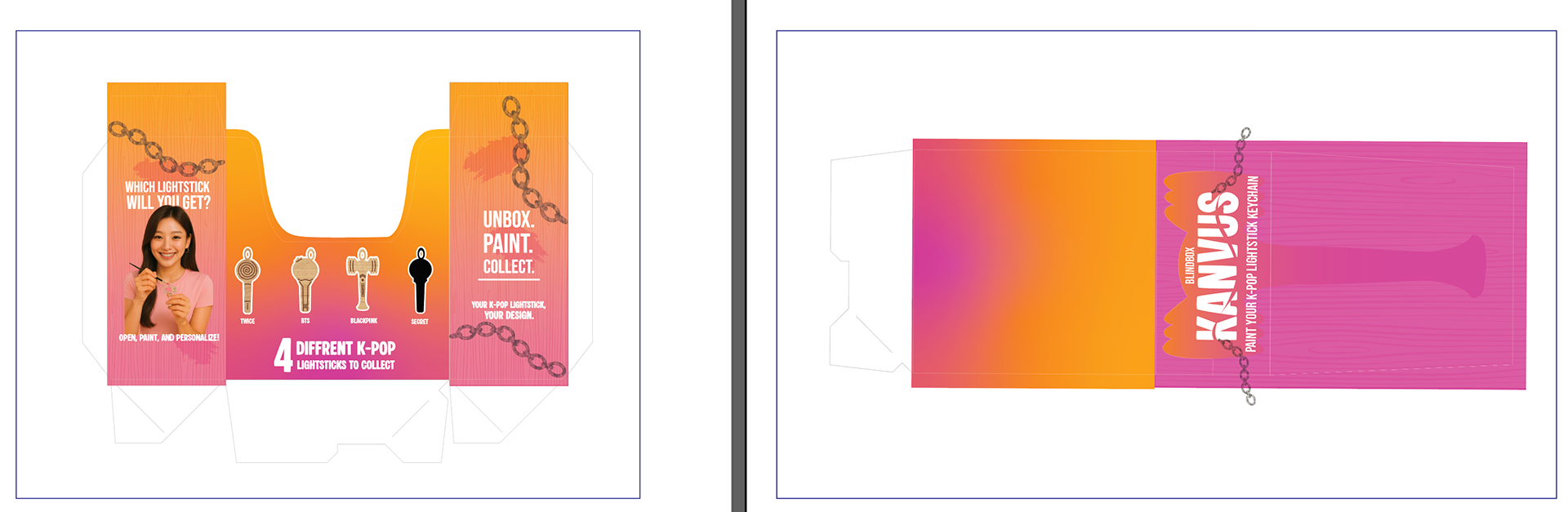
POP Display Case
After finalizing the tuck box, I began designing the POP display case, starting with the dieline. Using precise measurements and formulas, I created the structure after several trial runs. Once the dieline was complete, I moved on to the visual design. I incorporated the wood texture from the top and bottom of the box to create a cohesive look and utilized the available space to include slogans and product explanations. For the top of the display case, I created a unique design using the Blackpink lightstick silhouette, making it immediately recognizable to the audience. To highlight the interactive aspect of the product, I included an image of someone painting the keychain, which I generated with AI and then refined in Photoshop to achieve the desired look. Once printed, this was also laser cut so that it was precise.
Final Prototypes