Project Overview
This was a collaborative group project where we worked together to develop the branding, UI/UX, and prototype for a mobile app. The app was designed to help university students in the Charlotte area navigate food challenges, including allergies and dietary restrictions, making it easier for them to find safe and accessible dining options.
Problem
Navigating food options near Charlotte’s university area is challenging, as many restaurants do not clearly indicate allergy information or dietary-friendly options. This makes it difficult for students with specific dietary needs to find suitable meals, adding unnecessary stress to their daily routines.
User Personas
Based on interviews with students who face these challenges, we developed user personas to better understand their needs, behaviors, and pain points. These personas helped guide our design decisions, ensuring the app effectively addressed real student experiences and provided practical solutions for navigating dietary restrictions and food options.

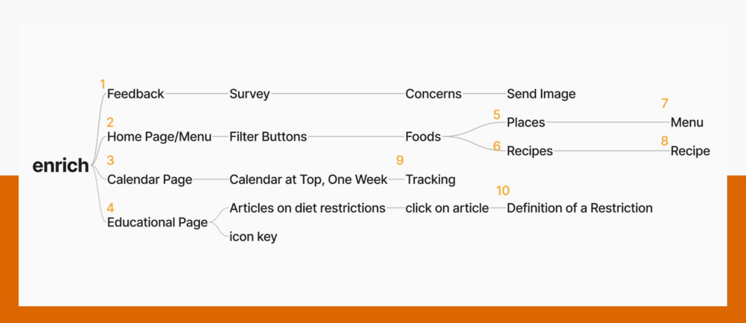
Sitemapping
Here, I laid out how the app would flow and what we needed to include based on our goals.
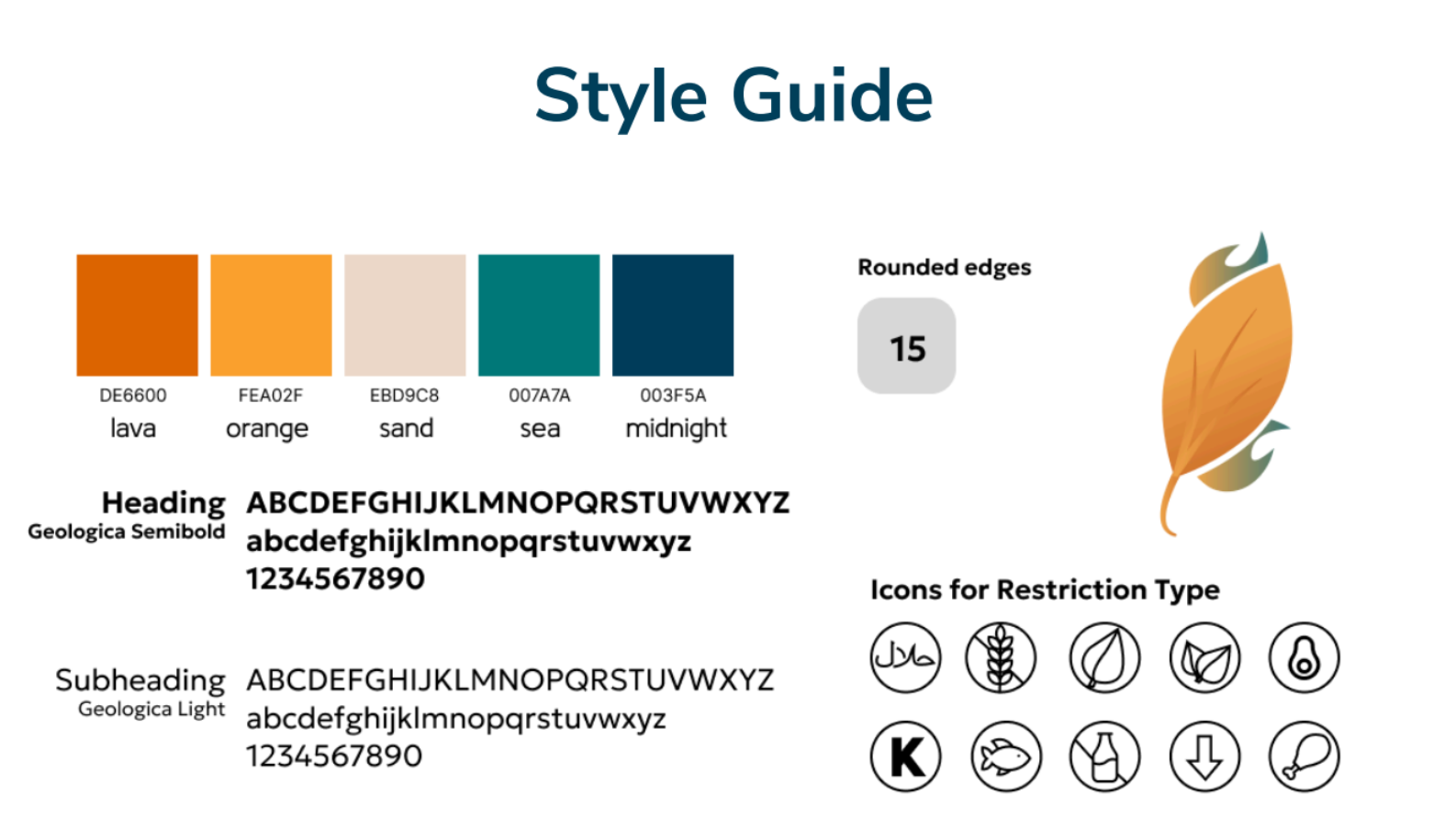
Branding
Before starting on wireframes, we established the app’s color palette, typography, and visual elements. We chose a bright orange and teal palette to create a fun, energetic vibe, moving away from the typical “health app” green. The font was selected to feel strong and formal enough for an informational app, while still maintaining a casual, approachable tone for students. The logo incorporated leaf and flame/wind imagery to convey movement and energy, and we designed a set of custom icons representing dietary restrictions, making it easy for users to quickly identify what foods were suitable for them.
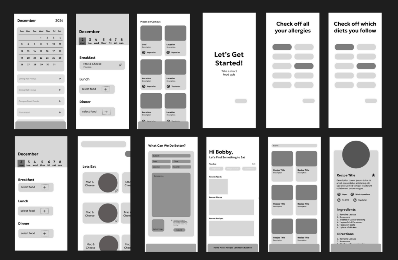
Wireframming
We created wireframes for key parts of the app to map out the layout and determine the placement of content and interactive elements.
AB Testing
We conducted user testing to improve the overall flow and usability of the app. Based on feedback, we updated the icons from emoji-style graphics to clean line art for better clarity, changed the search bar from orange to white to reduce visual distraction, and refined the navigation bar spacing to make interactions easier and more intuitive.

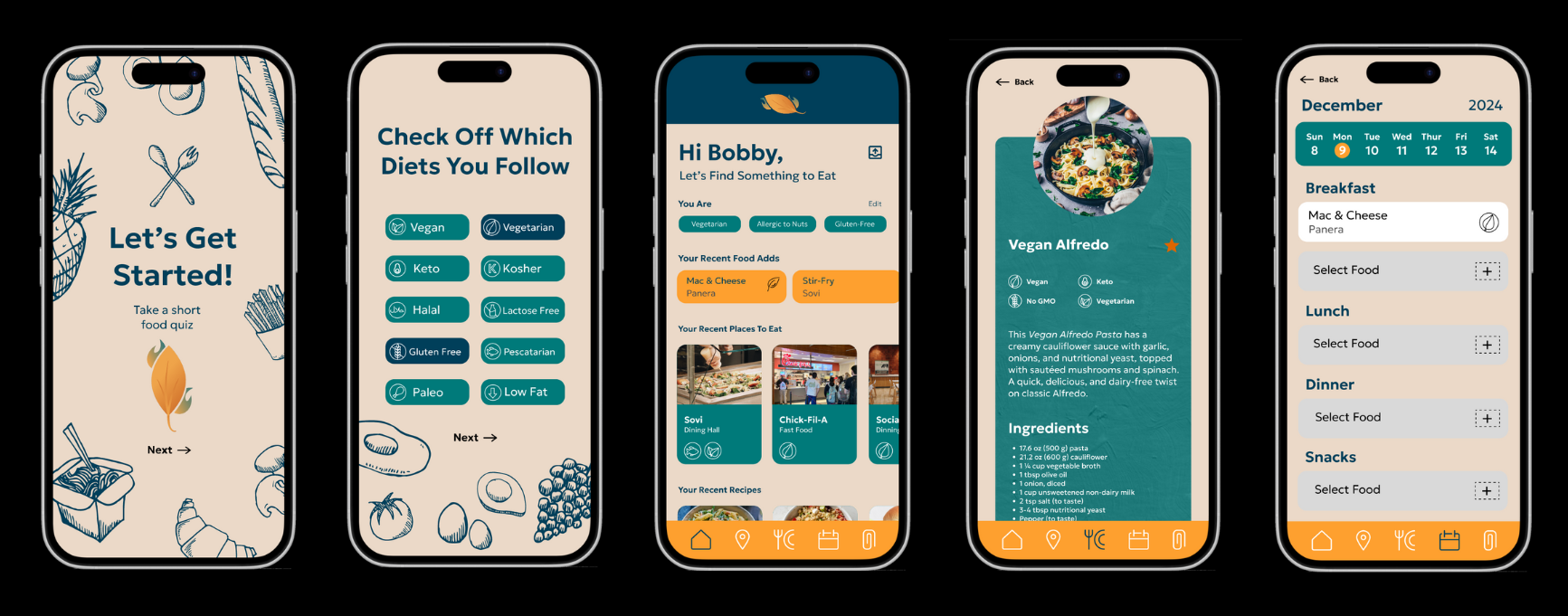
Final Prototype and High Fidelity